|
|
This topic comprises 2 pages: 1 2
|
|
Author
|
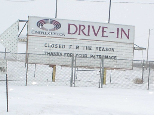
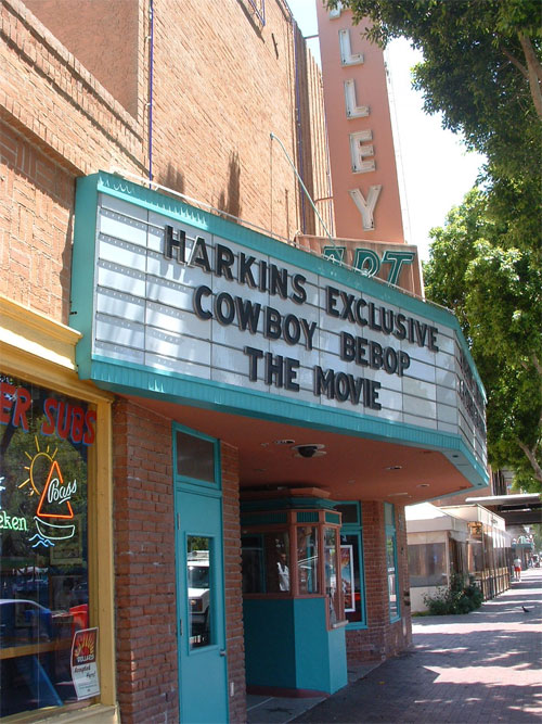
Topic: Old style marquees (Snap-Lok letters)
|
|
|
|
|
|
|
|
|
|
|
William Hooper
Phenomenal Film Handler
Posts: 1879
From: Mobile, AL USA
Registered: Jun 99
|
 posted 07-13-2005 01:20 AM


quote: Bobby Henderson
Where budgets allow, these types of changeable copy signs are falling out of favor and being replaced with LED-based electronic message centers. There's lots of advantages in such signs -with one of the big ones being you don't have to be out there in the weather trying to fiddle with letters using some suction cup thingie on a pole.
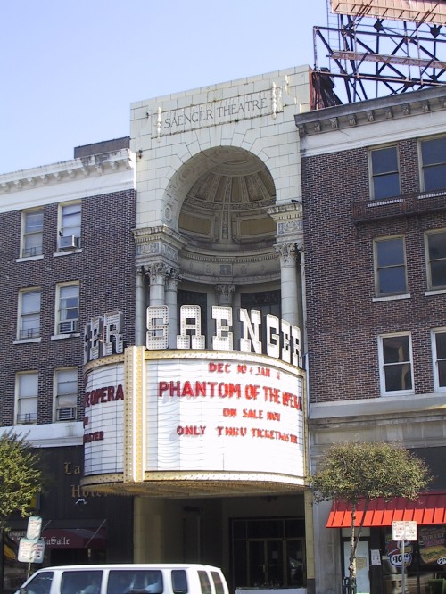
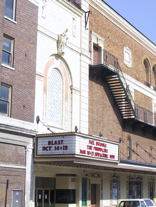
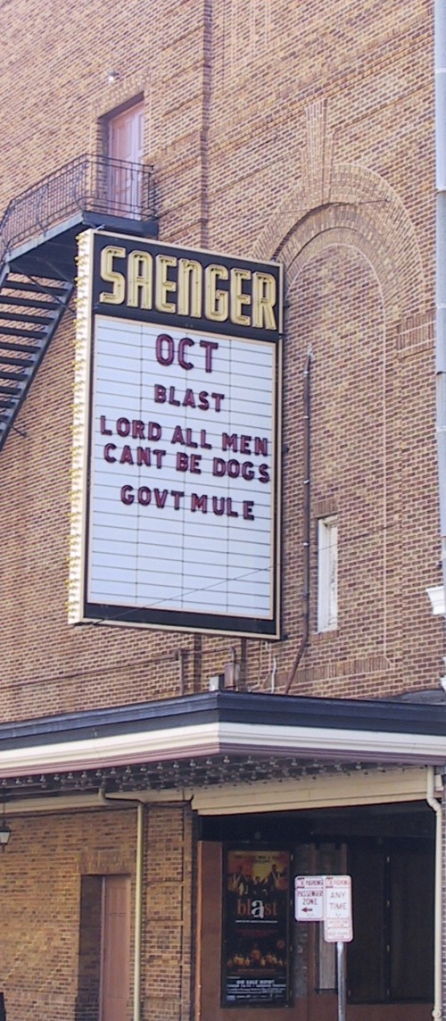
Except for historic applications. Some buildings on the National Register, prohibiting use of federal grant money (which lots of non-profits live on)to be used to alter the front of the building from original appearance. Also, for-profit historic theaters which do not seek grant money may be in historic districts where code may not allow alteration of the facade, etc. from historic appearance. The New Orleans Saenger is a for-profit in such a district & would not be able to replace its hanging-letter sign, not that it would want to do so, since the theatre has a permanent restoration & preservation program.
There are a number of non-profit PAC's that have gotten waivers, etc. to replace original hanging-letter signs with LED or fiber optic so it looks modern, they're too lazy to go out & change the sign, or they just want to be seen as "doing something", but historic facades with ultra-modern signage really do look not just awkward, but tasteless. In 10 years, they'll look just like the ugly commercial storefronts downtown built in the '30s or earlier that had contemporary aluminum & porcelain features strapped on the front to look 'modern' in the 50s & 60s that caused the blighted look that brought codes for facades into being in the first place.
| IP: Logged
|
|
|
|
|
|
|
|
|
|
|
|
Bobby Henderson
"Ask me about Trajan."

Posts: 10973
From: Lawton, OK, USA
Registered: Apr 2001
|
posted 07-19-2005 09:52 PM
Any custom sign company worth a damn will be able to make a theater marquee with little trouble. That includes the company where I work. But I'm not going to spam my company here.
We just made a pretty nice, but kinda generic, marquee sign for an unusual client: North Texas State Hospital, a mental care facility. It has a vertical "blade" type sign featuring open channel letters with exposed neon. The letters simply say "theater". The sign also has a V-shaped marquee using 4 inch Zip style letters.
It's not very difficult to make a great looking marquee at all. What's difficult it designing it where you can actually attach it to a building of any historical significance. Features of the building have to bear the load of the sign. Often you'll see tension cables, kickbacks and other stabilizing devices added to such signs to spread out the weight load of the sign.
quote: William Hooper
historic facades with ultra-modern signage really do look not just awkward, but tasteless
That really depends on two factors. 1: How the sign is designed, 2: How the sign is maintained.
On the design front, there's lots of hacks and wannabes in the sign industry and graphic design industry in general who really need to have jobs elsewhere. That business is NOT a democracy. Not everybody deserves to get work there. It's just like any other skilled profession. You need to have some talent and skill to do the work. Unfortunately enough dumbasses out there believe computers are doing all the work and therefore believe anyone can do graphic design -so just hire the jerk willing to work for the least amount of money. If anyone wants to bitch and gripe about how bad the commercial districts look, particularly in regard to signs a major part of the cause is what I just described.
The maintenance factor is a much worse problem.
Some people may dislike LED video boards and think they're all obnoxious. But let's not overlook the areas where traditional changeable copy signs start looking like hell. The cabinets need periodic service. The letter track has to be cleaned otherwise dirt builds. Drive through any business district and you're bound to see at least a few changeable copy signs with burnt out lamps and ballasts --if not blown out sign faces.
As far as taste goes, the thing I don't like about most changeable copy signs is the start white background. With smaller letters, the effect of halation can be a big problem. The lighted white background can literally flood away the readability of the letters. It's a pain to make reverse "Zip Lite" letters and other similar solutions work well.
Most LED-based boards, even the RGB video models, are flat units. They could use more style, particularly in how they're framed. However, some custom applications of LEDs have curved around building surfaces, replaced the chase lights in channel letters and been turned into flowing ribbons of color far beyond anything movies like Bladerunner predicted. Suchs signs represent the very top end of sign products. Unfortunately they're expensive as hell.
| IP: Logged
|
|
|
|
|
|
|
|
|
|
All times are Central (GMT -6:00)
|
This topic comprises 2 pages: 1 2
|
Powered by Infopop Corporation
UBB.classicTM
6.3.1.2
The Film-Tech Forums are designed for various members related to the cinema industry to express their opinions, viewpoints and testimonials on various products, services and events based upon speculation, personal knowledge and factual information through use, therefore all views represented here allow no liability upon the publishers of this web site and the owners of said views assume no liability for any ill will resulting from these postings. The posts made here are for educational as well as entertainment purposes and as such anyone viewing this portion of the website must accept these views as statements of the author of that opinion
and agrees to release the authors from any and all liability.
|
 Home
Home


 Printer-friendly view of this topic